“I have learnt so much about life in Malta in times before I was born simply by not being shy of knocking on a door and asking for information about the old, beautiful shop sign hanging above,” says Matthew Demarco, a graphic designer by profession and one of three people behind the Maltatype blog.
Maltatype is a showcase of traditional typography adorning the streets of Malta and Gozo but the team behind it also strives to preserve them by drawing from their style and using it to create original work.
But let’s start from the beginning. Like many other graphic designers, Matthew’s roots are in the fine arts. “I was fixated on the subject when I was young but as I grew older I realized that it is a subject that is good to know but that is sort of where it ends. Design – graphic, visual, digital – is a new medium. All the theory, the mathematics still apply bit this is a new way for me to funnel my knowledge of fine arts.”
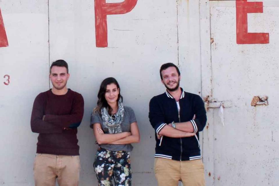
(From Left to Right: Ed Dingli, Katerina Karamallaki, Matthew Demarco)
He explains that he fell in love with graphic design after trying out a course at MCAST while waiting for a university course in fine arts that was due to begin the following year. “I loved the new stuff I was learning but it is very much something that grew from the love of fine arts.” All the books he bought in the last seven years, he explains, are about design whereas his previous purchases are all about renaissance, mannerism and the like.
So where did this interest in old shop signage come from? “Just curious interest, I guess. From walking around places and noticing things which you hadn’t previously noted. It lets me learn more about the subject and document it so that others will not have to start the process from scratch. It definitely has a lot to do with a love for hand lettering, not in a nostalgic sense but in a development sense. I was interested to learn about this type of typography so that I could use it in a digital format.”
Mr Demarco set up the blog around four years ago along with his study buddy Ed Dingli after realising that there was practically no resource about branding in Malta. “All we would find when researching for our assignments was foreign stuff. So we started this blog which now deals mainly, but not exclusively, with documenting street signage and shop signs.”
Discovering the story behind the signs
Matthew says he and Mr Dingli had a good base to start with as they already had a good stock of pictures. “We already had quite a collection of pictures that we had taken during our study years. We would wander around places like Valletta and Vittoriosa in search for signs instead of spending our free time locked away in the library. So it happened very naturally. This was not some tedious process.”
Going round in search for new signs often also revealed the story behind them. “We would be in one of these places and see a sign and ask the owners about it. They would tell us the story behind it, sometimes leading us to the people who actually produced the signs. It so much more than just type - it becomes anthropological, in a way. Once we started putting these images online people started contacting us and giving us more and more. I would say around half the material we have on our website was given to us by members of the public. That is the beauty of it – we did not want this to be something that is owned by anyone. We wanted it to be public, for everyone to enjoy or use as a resource.”

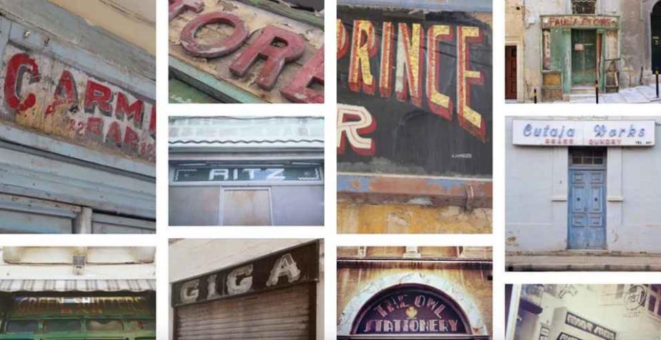
Maltese signs somewhat unique
There are currently photos of around 300 individual signs on Maltatype. “It is a very curated thing. Sometimes we receive pictures of signs that are not really that interesting and we don’t include them on the blog. We want the stuff on there to be an item of beauty after all.”
He says the places with the largest concentration of signs include Valletta, Senglea, Vittoriosa and Floriana. “Most are in place that were either highly frequented by British servicemen or former shopping areas where trade had plummeted and people never reinvested in. Some examples include Manwel Dimech Street in Sliema and Straight Street, Valletta.”
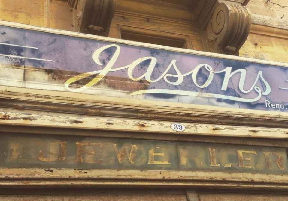
Matthew explains that he is not into making signage – it is not what interests him, he says. Yet he has picked up a lot of information along the trail. “I found that in Continental Europe a lot of signage was made using gold leaf. There are a lot of examples in Paris. You would have a glass sign which is painted black with the lettering left transparent and you would have gold leaf pressed to the back so it would shine through the negative space. In Malta there were some like that, especially ones that were being made by people who were gilding the churches, clocks and furniture. But gold leaf was not something that was very accessible or affordable at the time. A grocer who would want an attractive sign but could not afford gold leaf would resort to other options. They were using mirrors as backing, scraps and, eventually, tin foil. I’ve personally never seen this aboard although it could have been used in some places. In the case of Malta it was an alternative to the less accessible gold leaf.”
Original content inspired by traditional typography
Apart from discovering and documenting these works of art, Matthew and Ed eventually started creating their own original works, based on the material they had documented. “We wanted to make something genuine so we started experimenting with the typography, colours and textures found in the traditional shop signs they had documented.
“Many times we use the typography we see in old street signs in our work. But it is not necessarily the typography. It can be just one feature from a particular type style, like what we call ‘tberfil’ in Maltese – those flairs coming out from the ends of a letter. You can experiment with just that, for example. Another interesting feature is the way outlines are used in certain type styles so that a light can shine through the glass. You could explore what you could do if you remove that effect. When exploring a new idea you usually start off at one point and end up at a very different place. If you manage to rope in the original concept in the final product, usually there’s this honesty to it.”
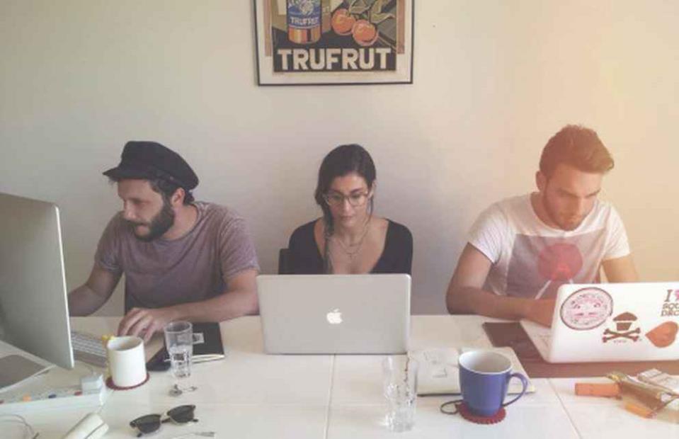
Their work includes fonts inspired by those found on shop signs, T-shirts with similarly inspired designs, posters, branding and even a calendar with fonts taken from shop signs found around Malta. The team, now also comprising Cypriot designer Katerina Karamallaki, is currently working on a series called ‘Shopfronts of Valletta’ – comprising digital representations of some of the most iconic shops in the capital. “We did this just for fun but there has been a lot of interest and people were asking to buy this stuff.”
Yet he describes Maltatype as the “opposite” of a full-time job. “It costs us so much money and time to do, as a labour of love, and we never really make anything from it.”
Branding Notte Bianca
Matthew says, however, that the style he has picked up from Maltatype usually finds its way into his full-time job as a freelance designer even if working for a client does not always give him the leeway he enjoys when working on the blog.
One of the projects Matthew has been entrusted with is the branding for this year’s edition of Notte Bianca. He is doing it under his own name while still wearing a Maltatype hat, he says. In fact, the branding for this year’s event will be influenced by Maltatype research.

“Last year’s branding was meant to celebrate the 10th anniversary. This year is not an anniversary so let’s give Notte Bianca something which is contemporary in terms of a logo and brand, but I want something which is also inspired by Valletta, not only in terms of visuals but also in terms of this new culture that is happening there. I want to give a contemporary feel to something which is usually associated with tradition. Notte Bianca is all about making Valletta alive at a time when it is usually dead, at night time, when all the shops are closed. I would like the branding to represent that but in a bigger picture – not about just one night.”
Put down your phone, appreciate your surroundings
Matthew believes that much of the work one can see on the blog is already ingrained in our subconscious – it is imagery we have seen but not really noticed, or admired. The fact that he and the team are drawing from that style makes their original work more familiar and pleasing. “One of the aims of Maltatype was to take an existing concept – like signage from disused buildings – and presenting it alone, without the context of a dirty road and abandoned buildings. People see it differently. All three of us work in the graphic design field. We were very conscious of wanting to expose the beauty behind this stuff by presenting it in a well-designed manner.
Many people show interest in the website – they see a photo and go ‘Wow, that’s in Valletta. I walk down that street every day but I had never really appreciated it.’ It doesn’t take much. Look around you, appreciate what there is. You are in a beautiful place but you are only looking at your phone as you go through.”
The project, he says, has opened his eyes to such things, making him much more aware of his surroundings and the hidden gems to be found.